
By Carl Edwards
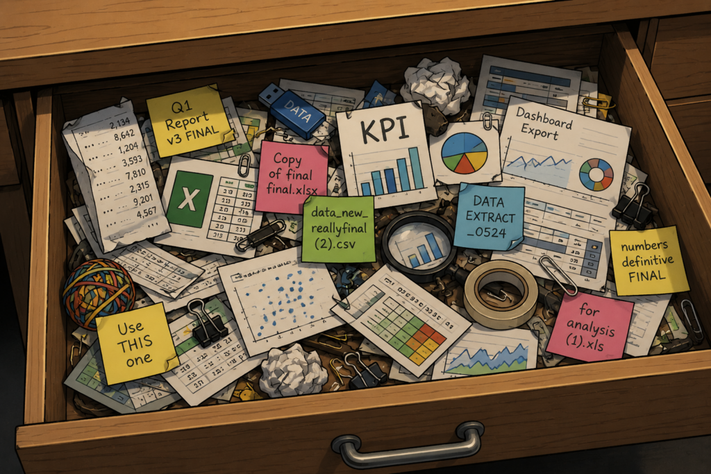
Dashboards were meant to help us make better decisions. Somehow, many have become the place data goes when nobody knows where else to put it.
A chart here, a filter there, a KPI wedged into the corner for good measure. It shows everything except the answer.
If someone still has to export the data, open Excel, message three colleagues and ask BI for “one more view”, the dashboard has not solved the problem. It has joined the admin pile.
Charts Don’t Make Decisions
Most organisations are not short of information. They are swimming in it.
Information can look useful while doing very little. Understanding is different. It tells someone what changed, why it matters and what to do next.
That is where many tools fall down: the insight sits too far away from the moment it is needed.
Be More Sat Nav

Nobody opens a sat nav because they love road layouts. They open it because they want to get somewhere without accidentally touring three industrial estates and a dead end.
The value is not the map. It is the warning, the reroute and the nudge that says, “this way is quicker.”
Useful analytics should work the same way. Flag the unusual thing. Surface the one metric that matters. Turn the twelve-tab report into a plain-English next step.
That is when a product becomes harder to replace: it saves people from asking, “what am I looking at?”
Sometimes the smartest feature is not another visual. It is one clear sentence at exactly the right time.
The Question Worth Asking
“When something changes, do users know what to do next?”
If they do, you have built something more useful than a reporting feature. You have built something that makes work easier. And frankly, that beats another pie chart.